Orbit
JavaScript Motion UIAn image and content carousel with animation support and many customizable options.
Basics
Orbit doesn't automatically generate any HTML for you, giving you the flexibility to move around the various pieces of the plugin. Here's a complete example—we'll break down the individual pieces farther down.
Please note that apart from Javascript, Motion UI is a dependency for Orbit to work properly. If in case, you don't want any animations within your Carousel, you can always disable the animation.
 Watch this part in video
<div class="orbit" role="region" aria-label="Favorite Space Pictures" data-orbit>
<ul class="orbit-container">
<button class="orbit-previous"><span class="show-for-sr">Previous Slide</span>◀︎</button>
<button class="orbit-next"><span class="show-for-sr">Next Slide</span>▶︎</button>
<li class="is-active orbit-slide">
<img class="orbit-image" src="assets/img/orbit/01.jpg" alt="Space">
<figcaption class="orbit-caption">Space, the final frontier.</figcaption>
</li>
<li class="orbit-slide">
<img class="orbit-image" src="assets/img/orbit/02.jpg" alt="Space">
<figcaption class="orbit-caption">Lets Rocket!</figcaption>
</li>
<li class="orbit-slide">
<img class="orbit-image" src="assets/img/orbit/03.jpg" alt="Space">
<figcaption class="orbit-caption">Encapsulating</figcaption>
</li>
<li class="orbit-slide">
<img class="orbit-image" src="assets/img/orbit/04.jpg" alt="Space">
<figcaption class="orbit-caption">Outta This World</figcaption>
</li>
</ul>
<nav class="orbit-bullets">
<button class="is-active" data-slide="0"><span class="show-for-sr">First slide details.</span><span class="show-for-sr">Current Slide</span></button>
<button data-slide="1"><span class="show-for-sr">Second slide details.</span></button>
<button data-slide="2"><span class="show-for-sr">Third slide details.</span></button>
<button data-slide="3"><span class="show-for-sr">Fourth slide details.</span></button>
</nav>
</div>-
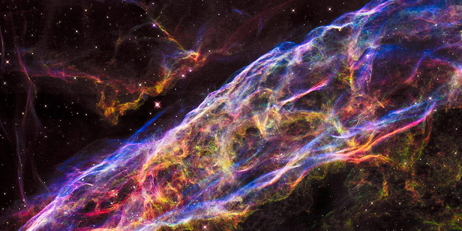
Space, the final frontier. -
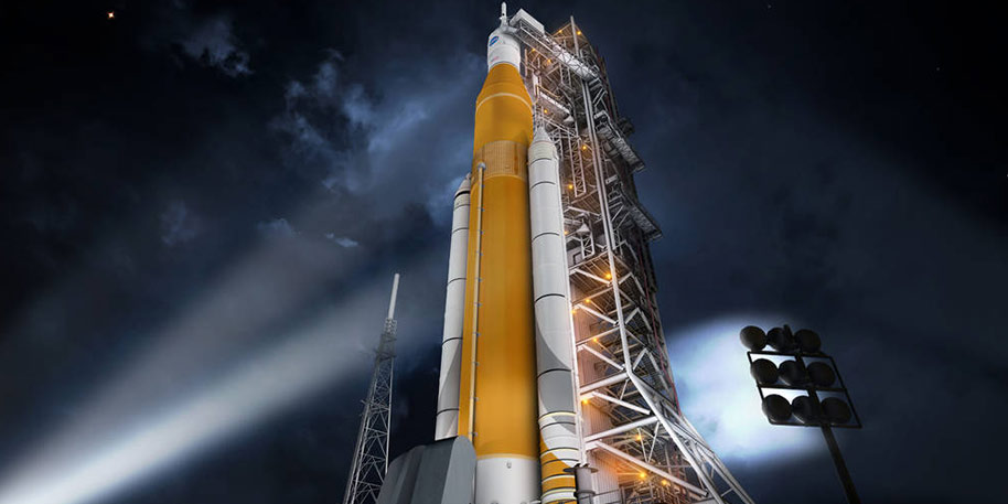
Lets Rocket! -
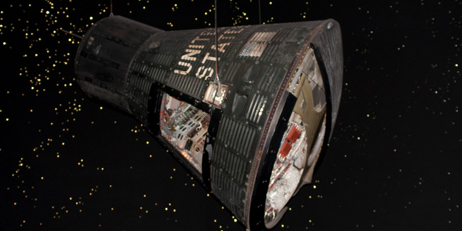
Encapsulating -
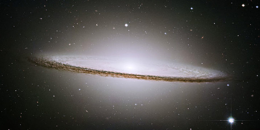
Outta This World
Wrapper
The wrapper houses the entire carousel. We use the aria-label attribute to label what the carousel is, for assistive technology.
<div class="orbit" role="region" aria-label="Favorite Space Pictures" data-orbit>
</div>
Slide Container
The slide container houses each individual slide. In our above markup example, we also placed the buttons in here, so we can anchor them to the center edge of the slide container. However, they can be moved anywhere within the data-orbit wrapper.
Each slide is an <li> with the class .orbit-slide. The first slide is marked with the .is-active class to indicate it's the default. You can place any HTML you want inside of the slide, but we have some premade styles for image-based slides with a caption.
<ul class="orbit-container">
  <li class="orbit-slide is-active">
    <img class="orbit-image" src="assets/img/orbit/01.jpg" alt="Space">
    <figcaption class="orbit-caption">Space, the final frontier.</figcaption>
  </li>
  <!-- More slides... -->
</ul>
Next/Previous Arrows
Orbit controls use the class .orbit-previous and .orbit-next. The below example has an important accessibility hook: since we're using ASCII arrows for the carousel controls, we add screen reader-only text (wrapped in the class .show-for-sr) that explain what the controls do.
<button class="orbit-previous"><span class="show-for-sr">Previous Slide</span> ◀︎</button>
<button class="orbit-next"><span class="show-for-sr">Next Slide</span> ▶︎</button>Bullets
The bullets serve two purposes: they mark the current slide, and can be clicked on to navigate to another slide. Like with the controls, the bullets also have screen reader-friendly labels.
<nav class="orbit-bullets">
  <button class="is-active" data-slide="0"><span class="show-for-sr">First slide details.</span><span class="show-for-sr">Current Slide</span></button>
  <button data-slide="1"><span class="show-for-sr">Second slide details.</span></button>
  <button data-slide="2"><span class="show-for-sr">Third slide details.</span></button>
  <button data-slide="3"><span class="show-for-sr">Fourth slide details.</span></button>
</nav>
Slide Contents
A carousel slide can contain images or HTML—you can even mix between slides in one carousel!
<li class="orbit-slide">
  <div>
    <h3 class="text-center">2: You can also throw some text in here!</h3>
    <p class="text-center">Lorem ipsum dolor sit amet, consectetur adipisicing elit. Unde harum rem, beatae ipsa consectetur quisquam. Rerum ratione, delectus atque tempore sed, suscipit ullam, beatae distinctio cupiditate ipsam eligendi tempora expedita.</p>
    <h3 class="text-center">This Orbit slider does not use animations.</h3>
  </div>
</li>Using Animation
Orbit uses Motion UI CSS classes to animate slides around.
Without the inclusion of the motion-ui Motion UI CSS file in your template, Orbit slider fails to work properly.
There are four plugin options you can set to change the default effects:
data-anim-in-from-left: transition to play when a slide comes in from the left.data-anim-in-from-right: transition to play when a slide comes in from the right.data-anim-out-from-left: transition to play when a slide comes out from the left.data-anim-out-from-right: transition to play when a slide comes out from the right.
Since those option names are pretty long, you can also set them all in one HTML attribute, using data-options:
<div class="orbit" role="region" aria-label="Favorite Space Pictures" data-orbit data-options="animInFromLeft:fade-in; animInFromRight:fade-in; animOutToLeft:fade-out; animOutToRight:fade-out;">
</div>-
Space, the final frontier. -
Lets Rocket! -
Encapsulating -
Outta This World
Disabling Animation
To disable Motion UI, set the plugin option useMUI to false. Written as an HTML attribute, that's data-use-m-u-i="false".
<div class="orbit" role="region" aria-label="Favorite Space Pictures" data-orbit data-use-m-u-i="false">
</div>-
Space, the final frontier. -
Lets Rocket! -
Encapsulating -
Outta This World
Sass Reference
Variables
The default styles of this component can be customized using these Sass variables in your project's settings file.
| Name | Type | Default Value | Description |
|---|---|---|---|
$orbit-bullet-background |
Color | $medium-gray |
Default color for Orbit's bullets. |
$orbit-bullet-background-active |
Color | $dark-gray |
Default active color for Orbit's bullets. |
$orbit-bullet-diameter |
Number | 1.2rem |
Default diameter for Orbit's bullets. |
$orbit-bullet-margin |
Number | 0.1rem |
Default margin between Orbit's bullets. |
$orbit-bullet-margin-top |
Number | 0.8rem |
Default distance from slide region for Orbit's bullets. |
$orbit-bullet-margin-bottom |
Number | 0.8rem |
Default bottom margin from Orbit's bullets to whatever content may lurk below it. |
$orbit-caption-background |
Color | rgba($black, 0.5) |
Default background color for Orbit's caption. |
$orbit-caption-padding |
Number | 1rem |
Default padding for Orbit's caption. |
$orbit-control-background-hover |
Color | rgba($black, 0.5) |
Default background color for Orbit's controls when hovered. |
$orbit-control-padding |
Number | 1rem |
Default padding for Orbit's controls. |
$orbit-control-zindex |
Number | 10 |
Default z-index for Orbit's controls. |
Mixins
We use these mixins to build the final CSS output of this component. You can use the mixins yourself to build your own class structure out of our components.
orbit-wrapper
@include orbit-wrapper;Adds styles for the outer Orbit wrapper. These styles are used on the .orbit class.
orbit-container
@include orbit-container;Adds styles for the inner Orbit slide container. These styles are used on the .orbit-container class.
orbit-slide
@include orbit-slide;Adds styles for the individual slides of an Orbit slider. These styles are used on the .orbit-slide class.
orbit-image
@include orbit-image;Adds styles for a slide containing an image. These styles are used on the .orbit-image class.
orbit-caption
@include orbit-caption;Adds styles for an orbit slide caption. These styles are used on the .orbit-caption class.
orbit-control
@include orbit-control;Adds base styles for the next/previous buttons in an Orbit slider. These styles are shared between the .orbit-next and .orbit-previous classes in the default CSS.
orbit-previous
@include orbit-previous;Adds styles for the Orbit previous button. These styles are used on the .orbit-previous class.
orbit-next
@include orbit-next;Adds styles for the Orbit next button. These styles are used on the .orbit-next class.
orbit-bullets
@include orbit-bullets;Adds styles for a container of Orbit bullets. Adds styles for the Orbit previous button. These styles are used on the .orbit-bullets class.
JavaScript Reference
Initializing
The file foundation.orbit.js must be included in your JavaScript to use this plugin, along with foundation.core.js. This plugin also requires these utility libraries:
foundation.util.keyboard.js
foundation.util.motion.js
foundation.util.timerAndImageLoader.js
foundation.util.touch.js
Foundation.Orbit
Creates a new instance of an orbit carousel.
var elem = new Foundation.Orbit(element, options);| Name | Type | Description |
|---|---|---|
element |
jQuery | jQuery object to make into an Orbit Carousel. |
options |
Object | Overrides to the default plugin settings. |
Plugin Options
Use these options to customize an instance of Orbit. Plugin options can be set as individual data attributes, one combined data-options attribute, or as an object passed to the plugin's constructor. Learn more about how JavaScript plugins are initialized.
| Name | Type | Default | Description |
|---|---|---|---|
data-bullets |
boolean |
true |
Tells the JS to look for and loadBullets. |
data-nav-buttons |
boolean |
true |
Tells the JS to apply event listeners to nav buttons |
data-anim-in-from-right |
string |
slide-in-right |
motion-ui animation class to apply |
data-anim-out-to-right |
string |
slide-out-right |
motion-ui animation class to apply |
data-anim-in-from-left |
string |
slide-in-left |
motion-ui animation class to apply |
data-anim-out-to-left |
string |
slide-out-left |
motion-ui animation class to apply |
data-auto-play |
boolean |
true |
Allows Orbit to automatically animate on page load. |
data-timer-delay |
number |
5000 |
Amount of time, in ms, between slide transitions |
data-infinite-wrap |
boolean |
true |
Allows Orbit to infinitely loop through the slides |
data-swipe |
boolean |
true |
Allows the Orbit slides to bind to swipe events for mobile, requires an additional util library |
data-pause-on-hover |
boolean |
true |
Allows the timing function to pause animation on hover. |
data-accessible |
boolean |
true |
Allows Orbit to bind keyboard events to the slider, to animate frames with arrow keys |
data-container-class |
string |
orbit-container |
Class applied to the container of Orbit |
data-slide-class |
string |
orbit-slide |
Class applied to individual slides. |
data-box-of-bullets |
string |
orbit-bullets |
Class applied to the bullet container. You're welcome. |
data-next-class |
string |
orbit-next |
Class applied to the `next` navigation button. |
data-prev-class |
string |
orbit-previous |
Class applied to the `previous` navigation button. |
data-use-m-u-i |
boolean |
true |
Boolean to flag the js to use motion ui classes or not. Default to true for backwards compatability. |
Events
These events will fire from any element with a Orbit plugin attached.
| Name | Description |
|---|---|
beforeslidechange.zf.orbit |
Triggers before the next slide starts animating in and only if a next slide has been found. |
slidechange.zf.orbit |
Triggers when the slide has finished animating in. |
Methods
geoSync
$('#element').foundation('geoSync');Sets a timer object on the orbit, and starts the counter for the next slide.
_reset
$('#element').foundation('_reset');Resets Orbit so it can be reinitialized
changeSlide
$('#element').foundation('changeSlide', isLTR, chosenSlide, idx);Changes the current slide to a new one.
Fires these events: Orbit#event:slidechange
| Name | Type | Description |
|---|---|---|
isLTR |
Boolean | flag if the slide should move left to right. |
chosenSlide |
jQuery | the jQuery element of the slide to show next, if one is selected. |
idx |
Number | the index of the new slide in its collection, if one chosen. |
destroy
$('#element').foundation('destroy');Destroys the carousel and hides the element.